
Take your AI images to the next level
A guide to writing prompts to generate AI images that don't look so... um... AI generated.


Over the last few years, I've worked with companies to build highly crafted products that engage users and grow fast. In that role, I often get to partner with stellar designers. Finnian Sturdy is the first person I turn to. He's the rare person who elevates everything he touches.
Recently, I was walking through some designs with Finn. He had incorporated stunning photography that fit perfectly with product's design. I asked him where he had sourced it from, fully expecting to learn about some elite stock photography site.
But, no. Finn had generated the images in Midjourney. These were the most evocative, natural, and useable AI-generated images I've ever seen. Finn generously agreed to share his secrets with me... and with you.
Welcome to the best guide on image generation I've found (works great for video too!).
Getting consistent, high-quality output from AI image generators can feel a bit like luck. Alright, a lot like luck. You can get much better results by better understanding how the AI interprets your words and structuring your prompts strategically. Here are my thoughts and techniques on how I get great imagery that I use daily in my design work.
A note: I use Midjourney as I find it the best one for image generating, but there are lots of others and these thoughts might apply to them too. Take ‘em all with a pinch of salt as I’m in no way an AI expert or image generator specialist. When it comes down to it, I'm just a guy, sitting in front of a screen… waiting for fuzzy images to load.
First thing is, let’s get the more technical bit out the way.
How Midjourney reads your prompts
Midjourney uses a diffusion model, a type of machine learning system trained on millions of images paired with text descriptions. Over time the model learns to understand the relationship between words and visual concepts. It creates images through a denoising process—starting with static and progressively adding detail until it forms a complete image that it thinks matches your prompt.
The AI breaks down your prompt into tokens—individual words or phrases—and weighs each element based on its training data. Words at the beginning of your prompt typically receive more attention, and the system looks for artistic concepts, styles, and subjects it recognizes from its vast dataset.
Midjourney also considers relationships between words. When you write "modern glass office," it understands this as a cohesive architectural concept rather than just "modern" plus "glass" plus "office" separately. This contextual understanding is what makes strategic word placement so important.
Okay, I’m oversimplifying things, but that’s the gist of it—now let’s look at actual prompts.
Breaking down an effective prompt
Let's examine a well-structured prompt to see how each element contributes to the final result:
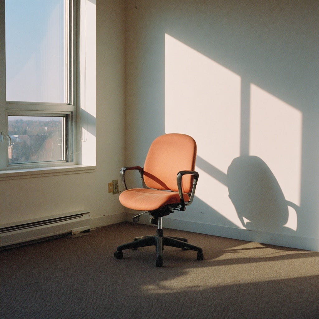
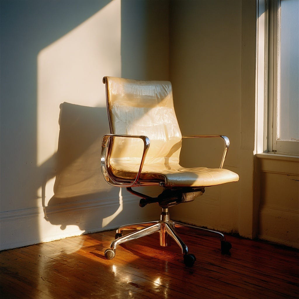
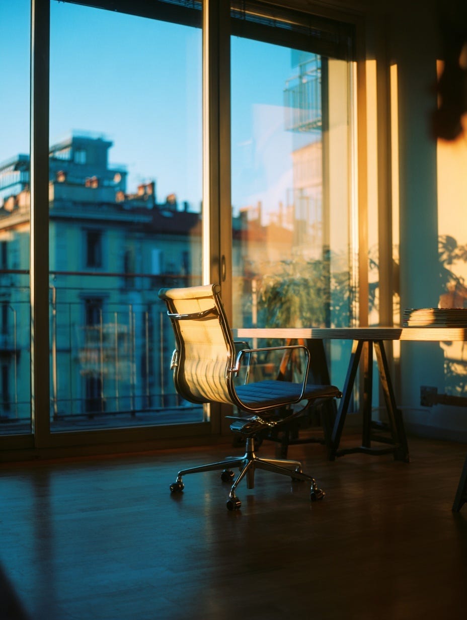
"An empty stylish office chair behind a trestle desk in the early morning light in a modern glass Italian architect’s office in Milan, FujiColor C200"
Here's how Midjourney would process each component:
"An empty stylish office chair"—Establishes the main subject with specific descriptors that guide the aesthetic"behind a trestle desk"—Adds compositional context and furniture style details"in the early morning light"—Defines the lighting quality and time of day"in a modern glass"—Sets the architectural environment and style"Italian architects office in Milan"—Reinforces the design aesthetic and cultural influence"FujiColor C200"—Applies the film stock's warm, saturated color palette
Each word builds upon the previous ones, creating layers of visual information that guide the AI toward a specific aesthetic vision.
The Foundation: Subject, Setting and Style
Every effective image generation prompt should include three core elements:
Subject
What is the main focus of your image? Be specific rather than generic. In our example, "stylish office chair" has more direction than simply "chair". The word "stylish" immediately suggests clean lines and contemporary design. Of course style is an opinion but you see what I mean.
The kind of chair with some questionable stains and broken levers
“office chair”The kind of chair colleagues pinch from you the moment you’re off for lunch
“stylish office chair”Setting
Where does the scene take place? Our example combines spatial relationships ( "behind a trestle desk" ), lighting conditions ( "early morning light"), and architectural context ( "modern glass office" ).
Style
How should the image look and feel? This includes both visual style. "Italian architecture” suggests sophistication and design excellence and technical approach by using the film stock reference "FujiColor C200”.
Word order and emphasis
Midjourney pays more attention to words at the beginning of your prompt. Notice how our example prompt prioritizes the main subject first: "An empty stylish office chair" leads the description, ensuring this remains the focal point even as other elements are added.
Effective structure: Subject → Key details → Setting → Lighting → Style references
Our example follows this pattern:
Subject:
"empty stylish office chair"Key details:
"behind a trestle desk"Setting:
"modern glass office"Lighting:
"early morning light"Style references:
"Italian architect’s office in Milan, FujiColor C200"
Lighting is what creates mood
The phrase "early morning light" in our example does a lot of the heavy lifting for our image. It suggests:
Soft, directional lighting
Warm color temperature
Long shadows
Peaceful, quiet atmosphere
Using time of day helps to get the mood better than trying to be overly specific about exactly what type of lighting you want. Natural phrases seem to work well, like “early evening”, “middle of the day”, and “late at night”.
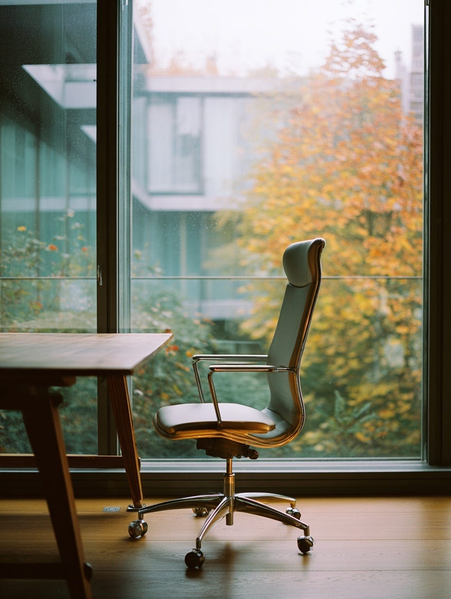
Seasonal lighting
You can also add seasons to help create the right feeling. For example changing this to something like an “autumn rainy morning light” to create that kinda dark and more gloomy lighting you get in the fall. Using this creates much better consistency than trying to describe the lighting itself. Notice how in these examples, adding a season invokes autumnal leaves and weather. Something you would otherwise have to specifically add.
Nice, feel that sun…
“An empty stylish office chair behind a trestle desk in the early morning light in a modern glass Italian architects office in Milan, FujiColor C200”Ok, where’s my brolly?
Style references and cultural cues
Adding "Italian" to our architectural prompt tells Midjourney a lot of hidden meanings to incorporate:
Clean, sophisticated design principles
High-quality materials and finishes
Attention to proportions and details
Modern European aesthetic sensibilities
Cultural and stylistic references work because they tap into Midjourney's training on countless images associated with these concepts.
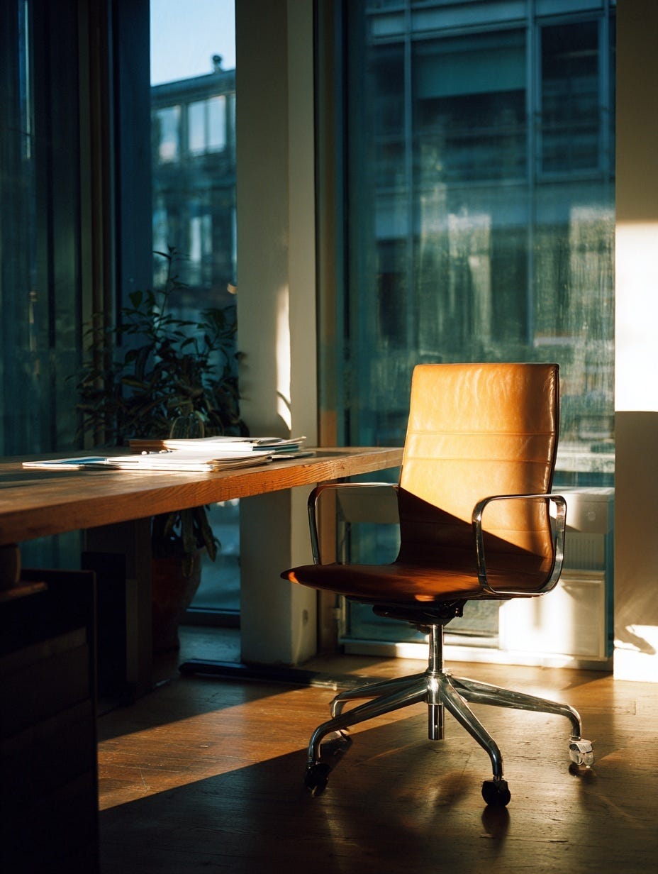
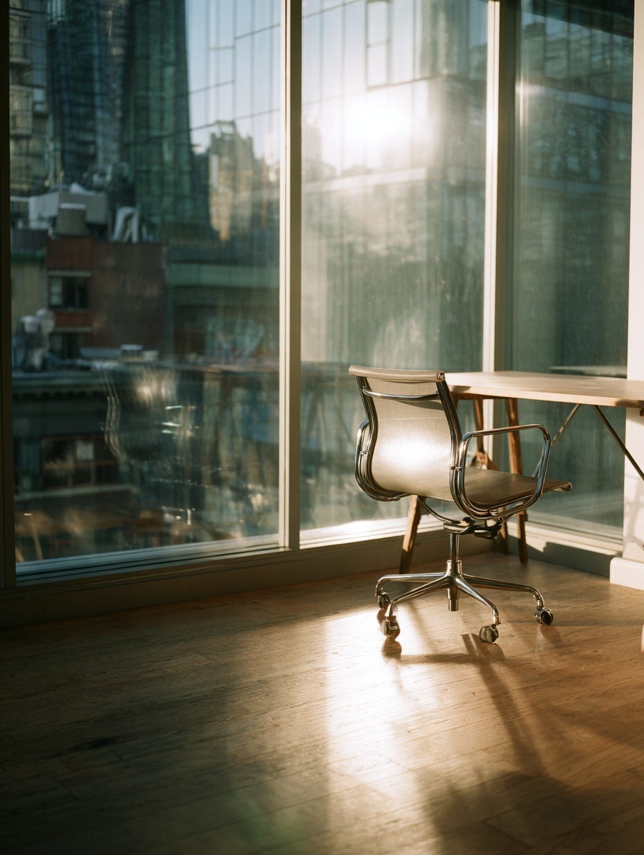
Buongiorno Milano
“An empty stylish office chair behind a trestle desk in the early morning light in a modern glass Italian architects office in Milan, FujiColor C200”Good Morning New York
The film stock secret
One of the most reliable techniques in Midjourney prompting is using film stock names. This approach provides instant, consistent aesthetic control without needing to describe complex technical details. Don’t worry if you don’t know any film stocks. There are some good’uns in here.
In our example, "FujiColor C200" tells Midjourney to apply:
Warm, slightly saturated colors
Film grain texture
Natural skin tones (if people were present)
Nostalgic color grading
Soft contrast typical of consumer film
Popular film stocks and their effects:
Kodak Portra: Warm, natural skin tones with beautiful color renditionKodak Ektar: Ultra-saturated, vibrant colorsKodak Gold: Warm, nostalgic vintage tonesFujifilm Velvia: Punchy, saturated colors perfect for landscapesFujifilm Pro 400H: Soft, dreamy pastelsFujiColor C200: Balanced, warm consumer film aestheticCinestill 800T: Dreamy nighttime glow with distinctive light halosKodak Tri-X: Classic black and white with strong contrast
Adding film stock references is far more precise than using vague terms like "cinematic" or "vintage". Try it out on any prompt and you’ll see what I mean.
Things to stop doing
Drop the LLM-generated prompts
Be careful when you generate prompts from LLMs as they often choose quite "cheesy" and overused descriptions. Things like "British leather chair in a country manor library." These clichéd combinations can make your images feel generic, predictable and just ‘meh’.
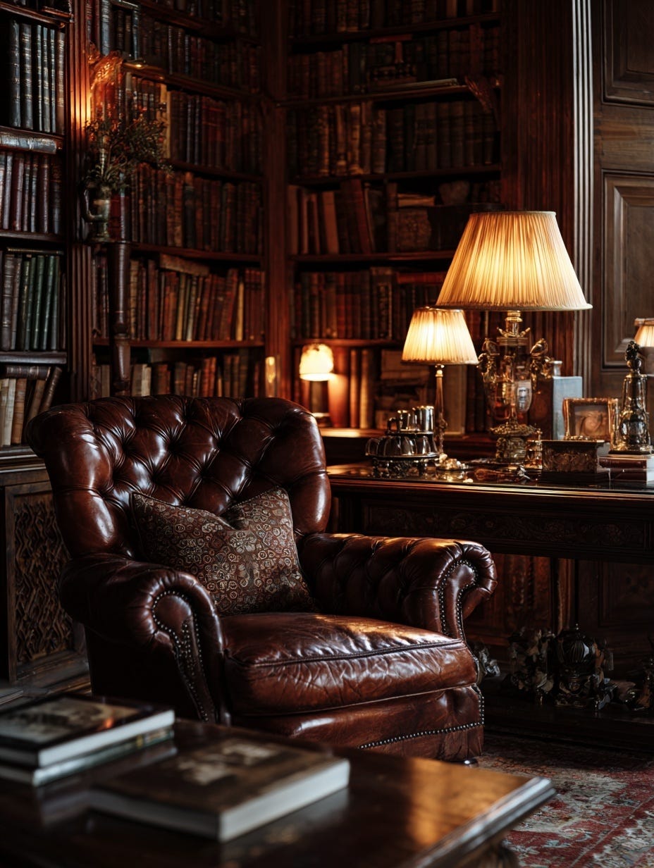
“An empty leather armchair faces floor-to-ceiling bookshelves in a private library illuminated by warm table lamps, traditional English manor, Victorian elegance, Fujifilm Pro 400H”Good prompt structure Claude, well done but I would say this is…. Twee.
Avoid generic personality descriptors
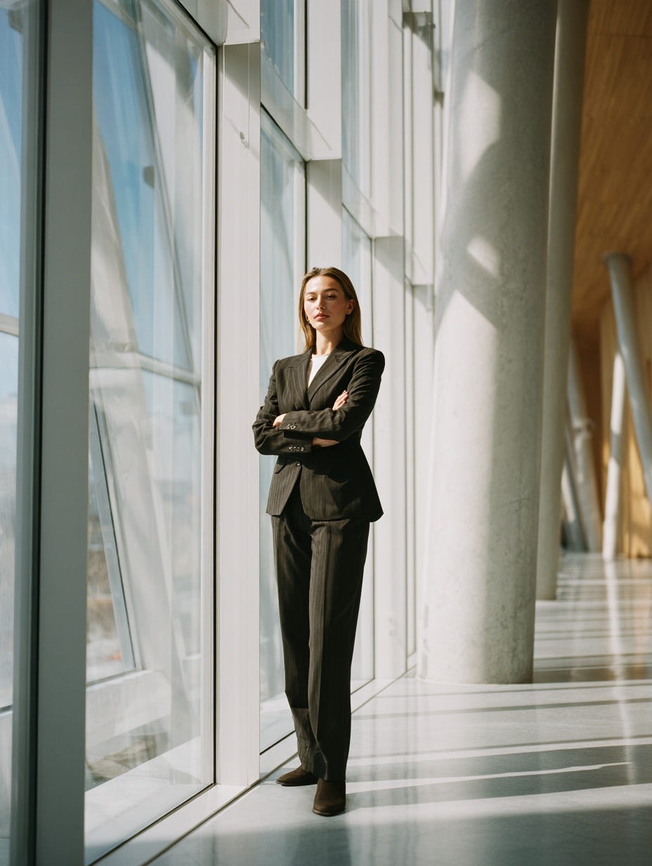
Try not to use prompts like "A confident CEO in a tailored blazer" as these often lead to overused body language cues which look forced and inauthentic. In this example, "confident" apparently means crossing arms, head tilted upwards, looking down your nose—that sort of thing. A bit basic and overdone.
Beware of bias
Representation: The other issue is bias & representation—a tricky subject to discuss—but one very much present in AI. Considering gender, race, cultural heritage, age and ability in your prompts will give you much better representation in the output. Sadly it seems AI has inherent human biases.
For example, images generated using "a confident CEO" come back waaaay too often as a white man. Sigh. Instead, maybe look to be more specific with your prompt. Why not use "a woman CEO in a tailored green suit, standing in her company's office" This gives you control over representation while avoiding generic stereotypes.
Body image: Another bias to be aware of when generating images of people is body image and weight—again another tricky topic—but images skew towards slim. So using appropriate natural language like “A portrait of a stocky man in white shirt” will get more realistic looking people. It seems that strangely more on the nose terms wield better results.
People seem slim by default
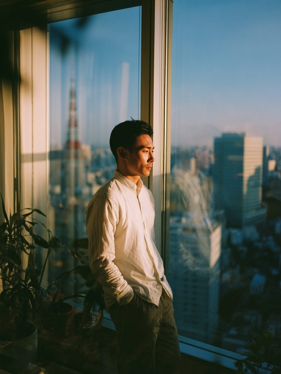
“A portrait of man in a white shirt, standing by floor-to-ceiling windows in a Tokyo apartment in the morning, shot on Kodak Portra 200”More realistic representation
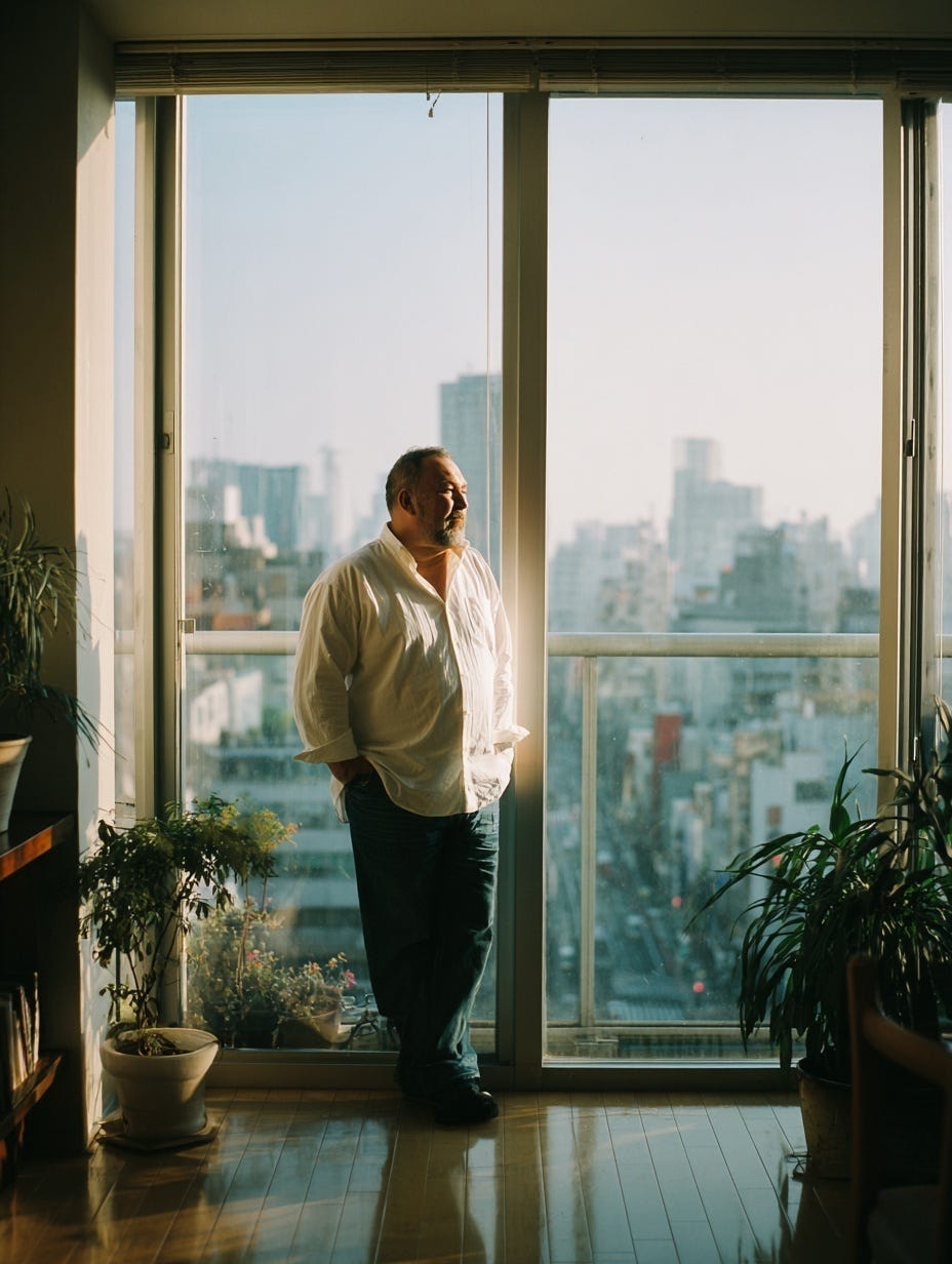
“A portrait of a stocky man in a white shirt, standing by floor-to-ceiling windows in a Tokyo apartment in the morning, shot on Kodak Portra 200”What about those modifiers?
The "--no" modifier limitation: This is like painting vs sculpting. A painter starts from a blank canvas and adds to create. A sculptor typically starts from raw material and removes to create. I have found AI image generation to be predominantly better at additive generation. When asking to remove bits or ignore things, you end up with weird artifacts and glitches and too many fingers. Sometimes this effect can be interesting and usable, but it's not easy to replicate.
What about “--stylize” This is the setting of how wild Midjourney should go. However when using film stock in prompts they seem to override the stylize settings. so if you're aiming for consistency then I would leave stylize alone and use film stock to get the feeling instead.
Overcomplicating & contradictory elements
Our example prompt is detailed but focused. Avoid rambling descriptions that dilute the core message. And don't mix incompatible styles like "modern glass office" with "rustic wooden cabin" unless that contrast is intentional.
Generic descriptions & spatial relationships
"Nice office" tells Midjourney nothing useful. "Modern Italian architectural glass office" is better. Also notice how our example establishes spatial relationships—the chair is "behind" the desk, not just somewhere in the room.
Things to start doing
Film stock strategy
Look around for film stocks you like and use the ones that work best for the context. Mixing and matching film references can work but often results in darker/moodier results. You can find lots on what film stock looks like and the vibe it gives out there on t’internet. But here’s a good article on Kodak vs Fujifilm to get you started.
Start conceptual, then refine
If you're struggling to know what to create, one way is to try a bland and unstyled prompt to see how it's interpreted, then use those as a starting point to refine and style it up.
A working example of this would be creating an image for an article or blog post. Let's say the post was about "Young people experience career burnout earlier than others." You could try that as a prompt but it will give you illustrations of heads on fire or smoking desks. The key is adding a film style, it narrows it down and although you'll likely get back some pretty bland options like people asleep at their desks—these can then be developed into more refined prompts.
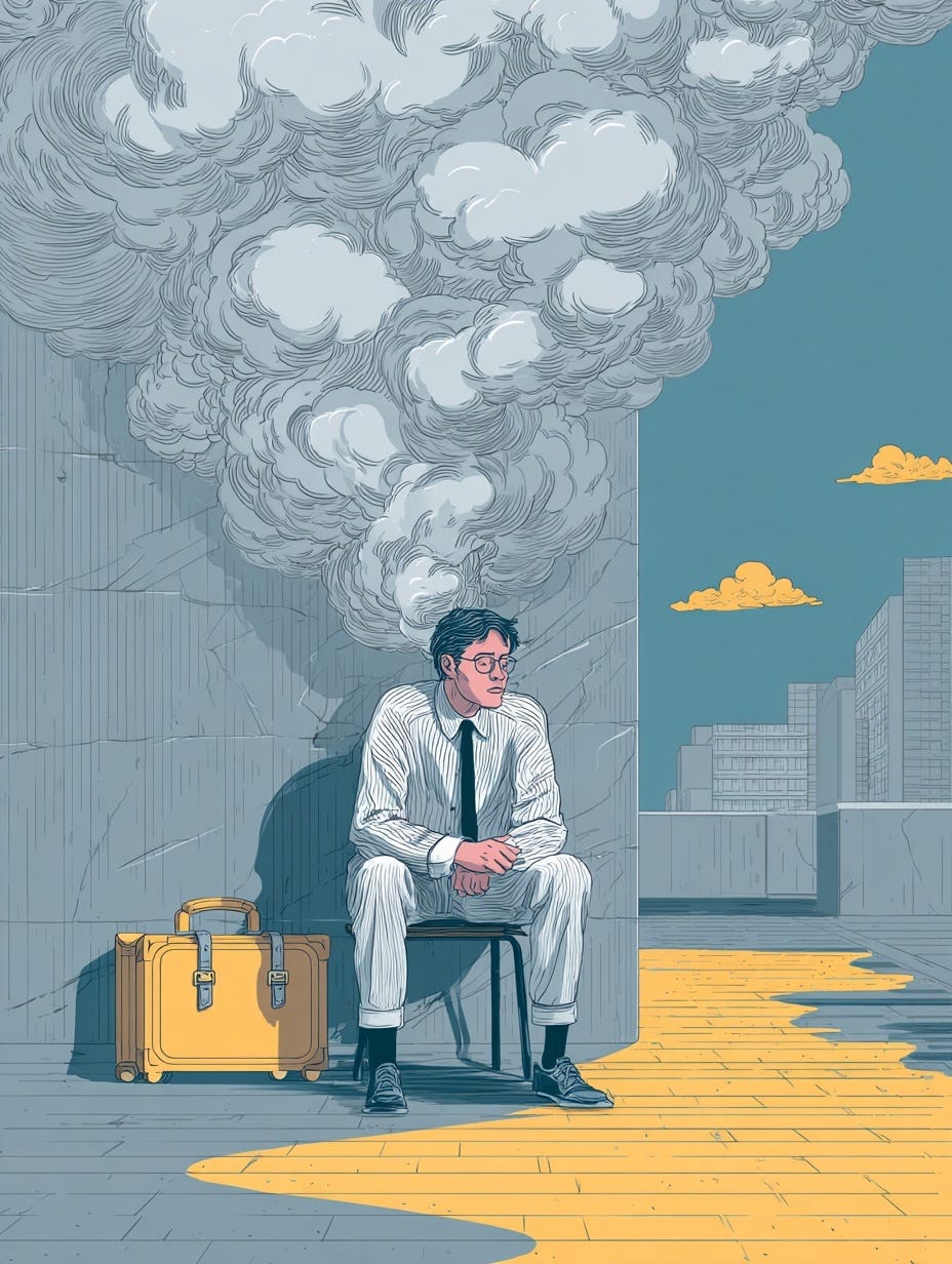
“Young people experience career burnout earlier than others”Ugh that’s a no to this one, right!?
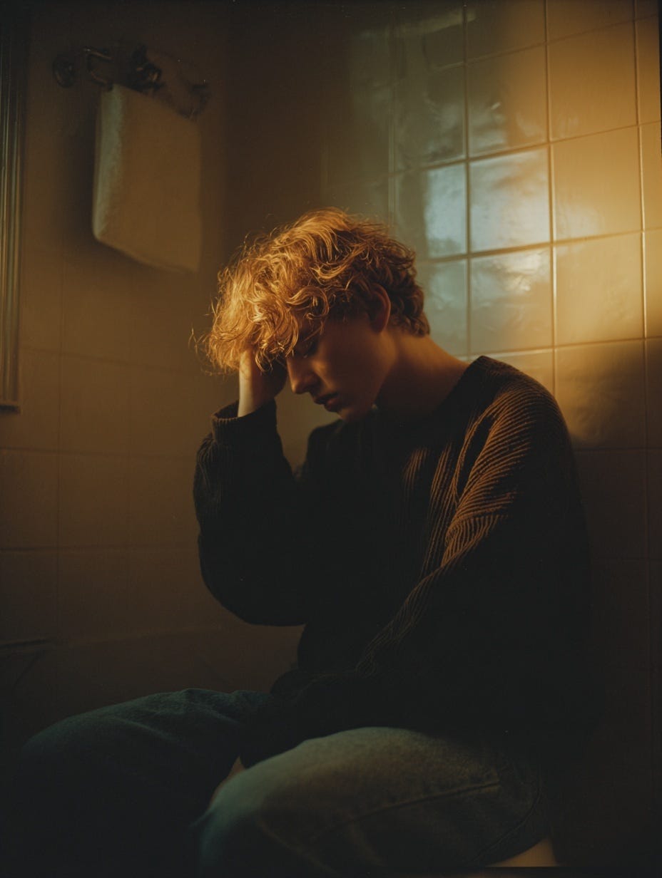
“Young people experience career burnout earlier than others. Kodak Portra”Okay, better. But are they in the loo?
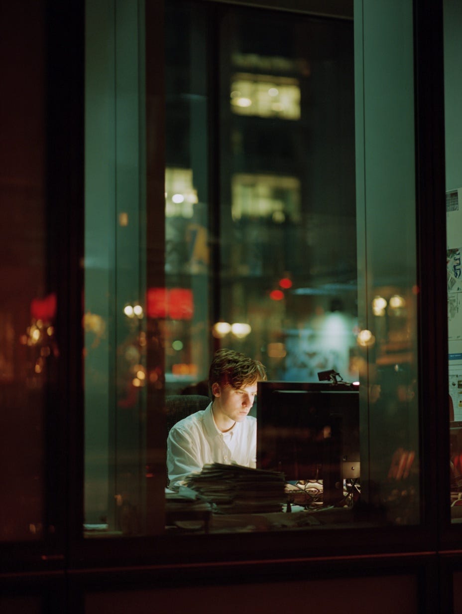
“Young person looking blankly at a screen in an office in downtown Madrid late at night. Kodak Portra”Alright, there we go. The vibe is ‘I’m the last in the office’ and the tone feels right & relevant but also kinda sad.
Natural vs. generic language
Use natural terms to get the mood right vs. generic or overly descriptive language. "Early morning" has a lot more metadata than "nice soft lighting".
Get inspired for better results
Yes, you can think of prompts off the top of your head. But finding images, photographers & visual references you like can really help refine the result. For example, "a portrait of a woman in her office" could be quite soulless or sterile. But with details like "books on desk corner" or "reflections of a street in Marseille” there could be too much noise in the image. So see how great photographers frame their images. What's the focus? The setting? How busy is the image? Basically channel your inner Laura Pannack.
Honing your eye
The last thing is a little more personal. And that is that it comes down to you and your taste. These tips can help create consistent, good quality generated images, but it's your taste that will decide which ones get seen or not. The good news is you might already have this, and it's developing all the time—the bad news is there is no shortcut to getting it dialed in.
A first step in your (Mid)journey
So if you made it here, well done. There is no prize I’m afraid but I’ll just leave you with this… Midjourney (and other image generation models) responds best to clear, meta-data rich direction. If you can communicate your vision using this structured approach, you’ll get better, more consistent results. Master this framework (aka copy & paste it) and you'll find yourself creating great images that you’ll actually want to use.
It’s Ravi again with a couple of final notes. First, there is actually a prize! Finn has put together an image prompt gallery and included more examples at the end of this post:
I got to thinking… why does Finn’s approach work so well?
Reading through these prompts brought me back to my childhood. You see, my Mom was a photo researcher—she was responsible for finding images for text books and other publications. She’d bring me into the office some weekends and I’d help pour over light tables full of slides, each carefully marked with a short description and keywords—essential metadata to find images in a time before the Internet. Yes, I’m dating myself.
A good prompt looks a lot like those descriptions written carefully by professional photographers who wanted their work to be properly cataloged. Other common elements include:
Film stock: Fujifilm Velvia, Kodak Portra, etc.
Camera brand: Leica, Hasselblad, etc.
Aperture: f1.2 (for blurry background), f22 (for sharp background)
Focal length: 18mm (for wide angle), 85mm (for portraits), 200mm (for telephoto)
Lens type: Fisheye, Macro, Tilt-Shift
Shutter speed: 1/8 (for motion blur), 1/500 (for freeze frame)
Exposure: Overexposed 1 stop, Underexposed 1/3 stop
Flash: On or off
It turns out, these elements work great for prompts. Here’s an example of two portraits, one generated without any camera metadata and the other generated with camera metadata:


The photo on the left looks bland and synthetic, while the photo on the right looks more authentic, artistic, and natural. The metadata provides specific information, but it also serves a higher-level purpose—it guides the model to use the more professional photos in its training data set and generates better output as result.
AI images have gotten remarkably good, but they often look a little off for production use. These techniques, and many more than you’ll discover, can take AI-generated images to the next level.
Have fun experimenting!
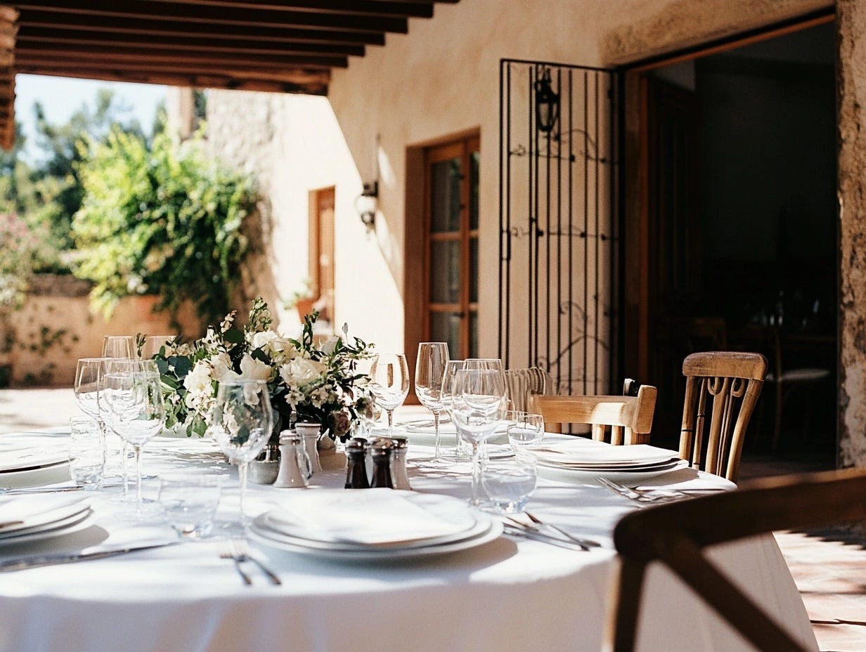
A table on a Spanish terrace is laid for a wedding in the early summer morning, Kodak Portra 400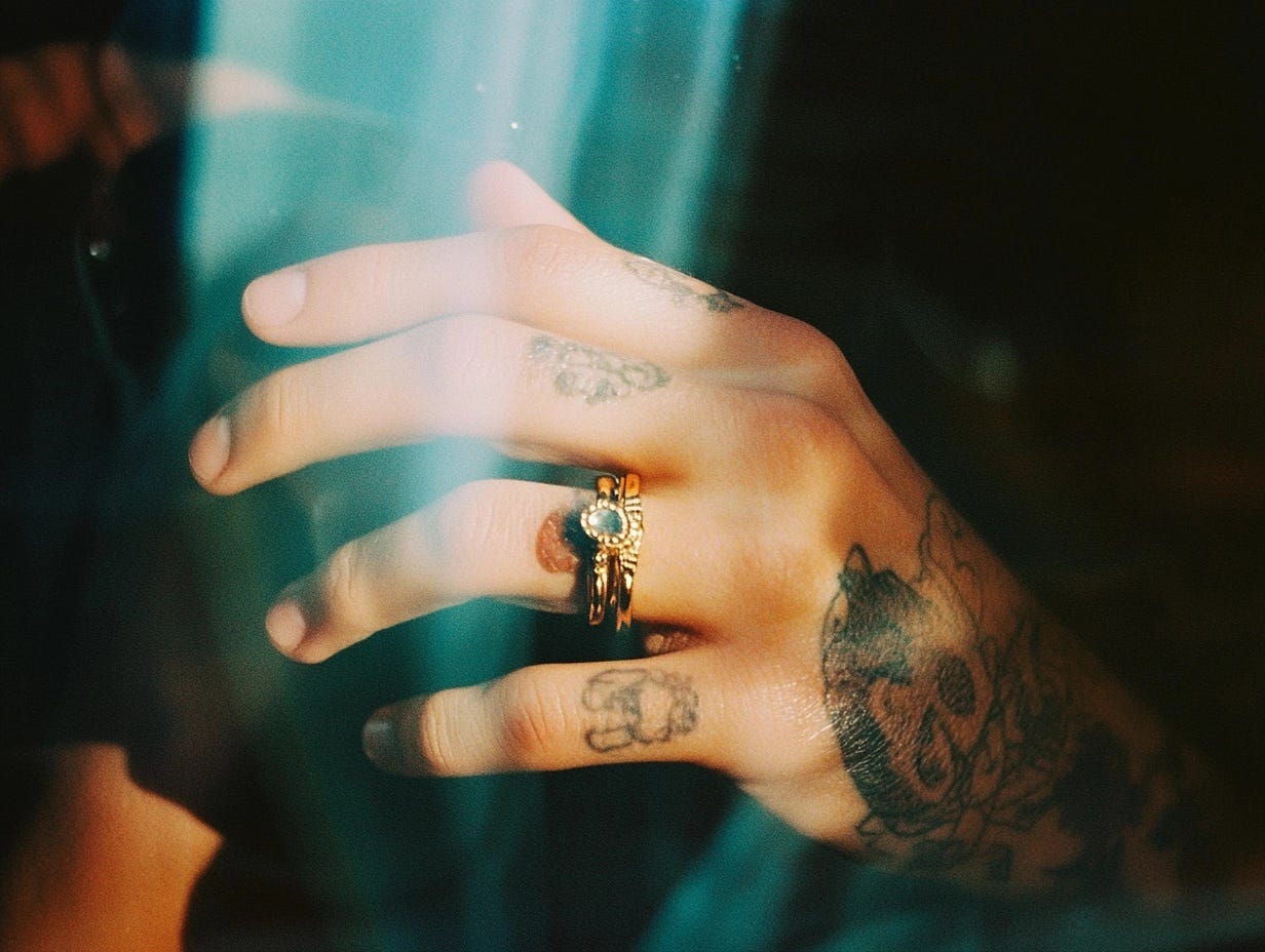
A hand is seen with 2 rings on the fingers & subtle tattoos in the late night through a reflection in a glass window. Kodak Gold 200
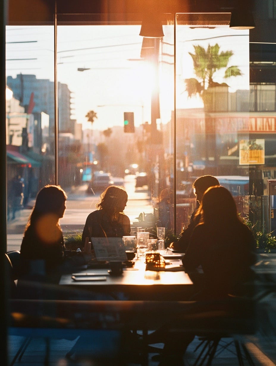
A team meeting in a boutique design agency in downtown Los Angeles in the early morning. FujiFilm C200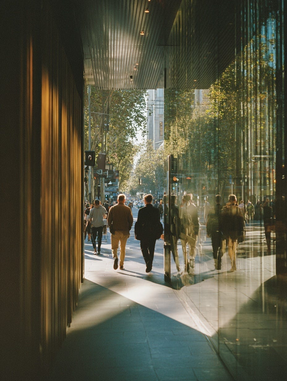
A street in Melbourne is seen with a group of people walking away on their way to brunch. Kodak Portra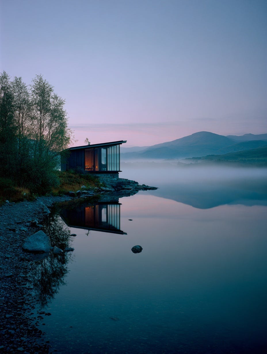
A solitary modern Scandinavian cabin with floor-to-ceiling windows overlooks a misty lake at dawn with mountains reflected in still water. Fujifilm Velvia 50 | A guest post by
|
Stunning. Thanks for the step by step breakdown, really useful to get the context.
Ravi, thanks for sharing this hard-to-come information.