

I’m not a designer, but I’ve learned you don’t need designer-level skills to prototype like one. In this video (my first on Substack!), I’ll show you how to go from blank page to beautiful prototype in about 30 minutes using Figma Make.
The prototype we’ll build: a music discovery timeline showing how genres evolved from their earliest days. It has good typography, actual album information, real cover art from Spotify, and smooth animations. The kind of prototype you’d put in front of customers, not a wireframe you’d apologize for.
That used to require days or weeks with a full team. Now it takes 30 minutes and a little bit of design thinking.
We’ll cover three things: how to rapidly wireframe your ideas, how to generate realistic data that brings those ideas to life, and how Figma Make combines them into something that feels real.
This post is brought to you by Figma Make.
Figma Make transforms your ideas into interactive prototypes in minutes—no coding required. Start from your existing Figma designs, bring in realistic data, and iterate through conversation. Try Figma Make free and see how fast you can go from blank canvas to customer-ready prototype.
Would you hire an architect who couldn’t draw blueprints?
Imagine you’re about to remodel your house. Your architect has been working diligently and she’s ready to share her plans. You sit down, and she hands you… a Word doc?!
“Trust me, it’s going to be great.”
Would you write the check? Of course not. Architecture is a visual medium. You need to see the structure, the proportions, how spaces connect. Words aren’t enough. You need blueprints.
Digital products work the same way. They’re visual and interactive. You can’t fully communicate a product idea through written specs alone.
For years, I’ve encouraged every PM I’ve worked with to learn wireframing. User experience design is an essential PM competency, not just the designer’s job. As I wrote in How To Become a Peak Product Manager:
The best PMs don’t just describe customer needs, they work with designers to translate those needs into easy-to-use experiences.
Here’s why this matters. When you write “the user taps the album cover and sees track details,” everyone pictures something different. Does a drawer slide up? Does the whole screen transition to a new view? The right answer depends on the user’s intent and the workflow you’re building.
You can’t leave those decisions to chance.
Instead, when you show the interaction visually, everyone sees the same thing. That’s what blueprints do.
Wireframes → a better way to prompt
Most people prompt AI design tools with words. But AI has the same problem your team does: words aren’t specific enough. Software is visual. Visual prompts work better.
Wireframes aren’t just a bridge between product and design anymore. They’re the blueprints that guide your whole team—humans and AI.
From blank canvas to beautiful prototype
Here’s exactly how I went from blank Figma page to working prototype. The process is surprisingly simple once you understand the pieces.
👋 Watch the video to follow along as I go through every step.
1. Start with the Simple Design System
I know, I know. The blank page is intimidating. What font will I use? Does that font size look nice? Should I bold the headlines? How do I create a button? Where do I find nice looking icons?
A few months ago, Figma introduced Simple Design System—available in every new file. Over 400 components, typography presets, colors, icons, and even full layouts.
To get started, I drop an iPhone 16 frame onto the page—again, an easy Figma preset that moves decisions off my plate.
2. Auto-layout everything
My next simplification: use Figma’s auto layout feature for everything. No manual positioning—Figma arranges things vertically or horizontally automatically. I even turn it on for the main iPhone 16 frame since mobile UI is just a vertical stack.
Using auto layout, I add some margins as well. I set 24 pixels for top and bottom margins, 16 pixels on the sides.
Pro tip: use multiples of 4 or 8 for spacing. It keeps everything aligned to a grid even if you don’t know design theory.
3. Rough out your first elements
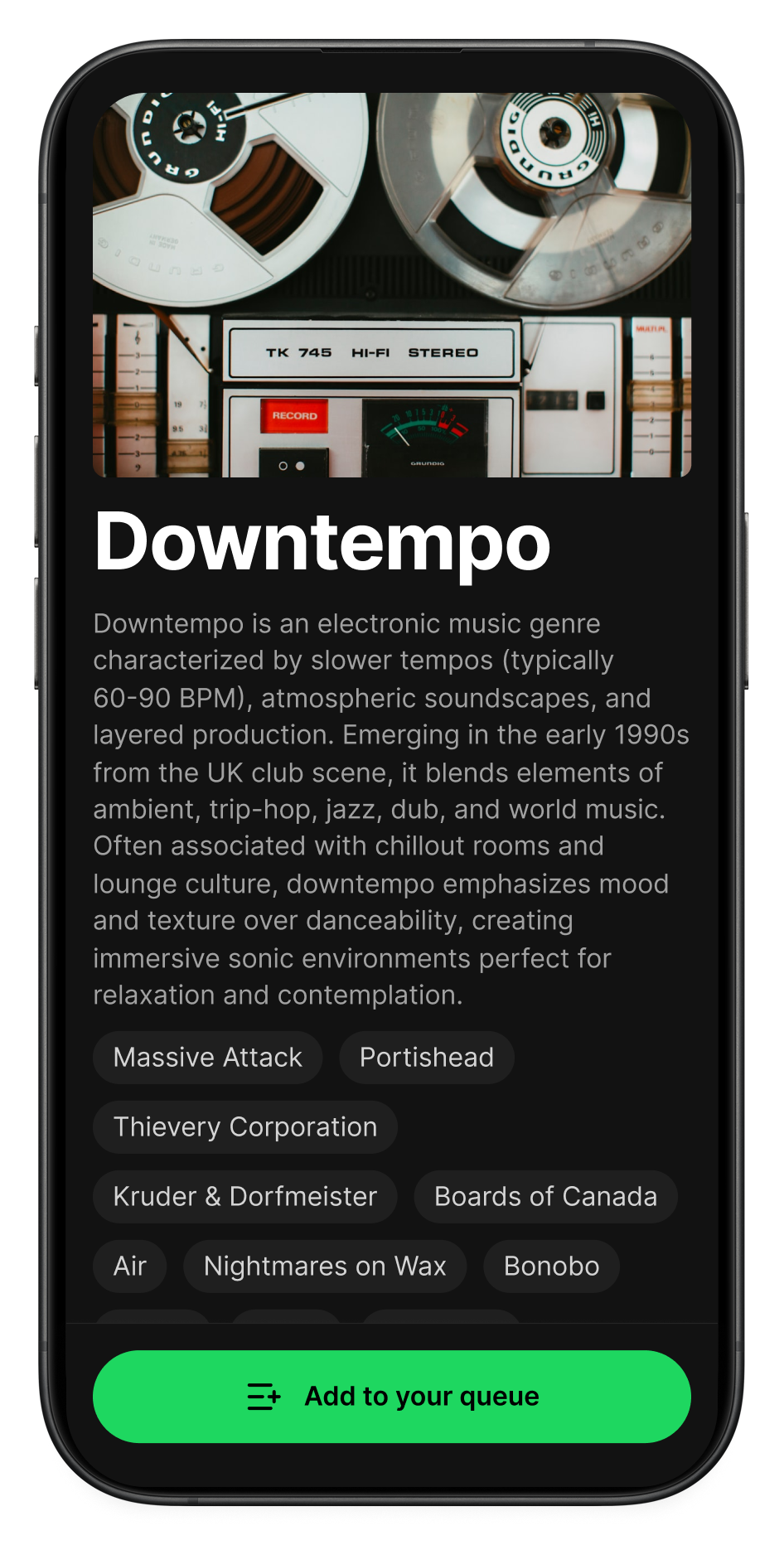
Let’s design a feature to explore a genre’s history through a timeline of seminal albums.
I want a cover photo at the top. So I add a gray square as a placeholder. Figma Make will fill this in with a real image later.
Name the layer “cover photo.” That naming matters—you’ll see why.
I add a title: “Downtempo.” We’ll build our wireframe around this genre, then use Claude to generate real data—artist names, album titles, descriptions—to make the prototype feel authentic.
The default text looks terrible. Wrong size, wrong font. But this is where Figma’s Simple Design System saves us. It has pre-built typography options. I choose “Title Page” and suddenly the text looks professional. I didn’t make any design decisions—I just picked from styles that already work together.
I add a description below the title, and set the text to the “Body Base” style. It fits in seamlessly.
Next, I add tags for the genre’s most important artists using Figma’s Tag component. Set horizontal auto layout, enable wrapping. Done.
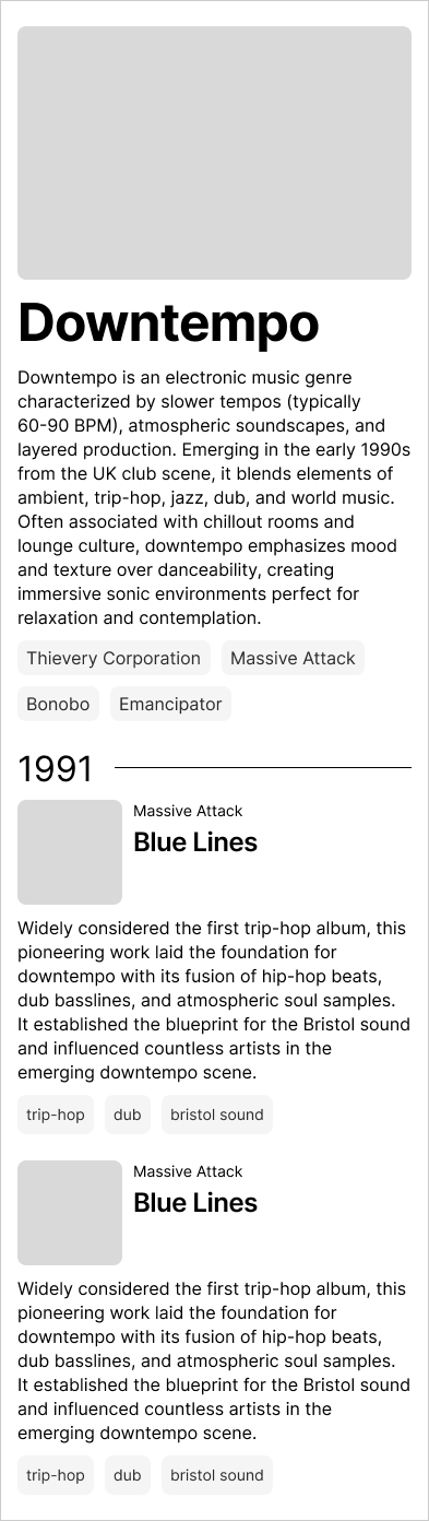
After about 10 minutes, I have a wireframe that looks pretty clean. But it’s still just boxes and placeholder copy.
4. Mix in realistic data
Great wireframes need great copy. The shapes show layout. The words explain the experience.
So far, the copy in my wireframe is “FPO”—for position only (fancy designer term!). I could spend hours researching Downtempo music—writing genre overviews, compiling artist lists, finding album details.
Or I could use AI, which excels at this kind of content generation. Here’s the prompt I gave Claude:
I’m interested in the history of downtempo music. Generate a JSON file that includes the genre name, a description, and an array of 15-20 milestone albums. For each album include: name, release date, artist, a 1-2 sentence description of why it was a milestone, and relevant tags.
Minutes later, I have what I need. Real artist names. Actual album titles. Release years. Well-written descriptions: “Mezzanine by Massive Attack (1998) - This dark, brooding album pushed trip-hop into more experimental territory with its heavy use of guitar samples and collaborative approach with vocalists like Horace Andy.”
This isn’t Lorem Ipsum. This is data that tells a story.
I asked for JSON because structured data is easier for AI tools to parse—important when we build our Figma Make prototype later.
But I’m missing something: album covers. I want real album art, not placeholder images. This is a little tricker for AI.
Claude won’t able to reliably look up album covers without a little help from a friend. I built an MCP server that fetches album covers from Spotify and Deezer. Took about 30 minutes in Claude Code (maybe a future post?). Now Claude can grab the real artwork for any album.
I ask Claude:
Add album covers to this dataset using the album-cover MCP server.
This will take some time. Let’s go back to Figma while Claude does its thing.
5. Finish the wireframe
I want each year to show its important albums. I layout the album UI: cover art, artist name, album name, description, and tags.
Every element is from the Simple Design System and auto layout makes it easy to get the UI laid out nicely. As needed, I pull over some copy from the JSON we generated to get a feeling for how it will look with real data.
In less than 20 minutes, the wireframe is done:
6. Send to Figma Make
Now, we’re ready to build the prototype. Right-click the design and select “Send to Figma Make.”
My prompt is dead simple:
Based on the attached design, build a feature that shows the timeline of a music genre. Use this data to build the prototype:
I paste in the JSON.
Figma Make reads my wireframe—the structure, the layer names, the semantic organization—and generates a working prototype. Real album covers appear in the right places. Artist tags populate at the top. The timeline structures itself by year with albums underneath.
Figma Make understands that the wireframe provides structure and the JSON provides content. It even replaces my placeholder hero image with an actual photo.
No code written. No manual placement of 20 album covers. Just a wireframe, a data file, and AI doing the rest.
7. Iterate with taste
The first version works, but I want to refine it:
Make the cover images larger and add a play button for each album.
Figma Make updates the prototype. Bigger album covers. Play buttons appear on hover with a nice animation.
Let’s change to a dark theme with full rounded buttons. Use this green as the primary color: #1ed760. Use dark gray for the cards #1f1f1f and even darker gray for the background.
The entire design transforms. It starts looking like Spotify. Professional. Intentional.
Add a cool animation to the year as a user scrolls down.
As I scroll down the timeline, each year animates in with a subtle effect. The albums fade in as they enter the viewport.
Each time, Figma Make doesn’t just do what I ask—it adds taste. Hover animations. Subtle fades. Professional polish.
Making the most of Figma Make
Most AI design tools ask you to describe what you want in words. Figma Make flips this: start with a visual, then AI builds from it.
After building this prototype, a few things stood out:
First pixel to working prototype in one tool. You wireframe in Figma, generate the prototype in Figma, iterate in Figma. No export/import dance. The entire workflow stays in the canvas where you’re already thinking spatially.
Simple Design System removes guesswork. You focus on visual thinking—layout, hierarchy, user flow—not all the details. The components have proper padding, correct spacing grids, typography that scales. You snap together pieces that work.
Semantic understanding beats screenshots. Sure, you can paste screenshots into any AI prototyping tool. Figma Make reads your actual layers, components, and structure. Screenshot tools see pixels. Figma Make sees meaning.
Built-in taste. Good spacing defaults. Typography that looks right. Animations that feel smooth. You don’t need design expertise to ship something professional.
The result? I went from idea to customer-ready prototype in just 30 minutes.
Better prototypes = better signal
Design-driven prototyping enables teams to accelerate the time from initial hypothesis to initial test. More importantly, it makes that test more reliable by helping teams create better prototypes.
Bad prototypes break the “suspension of disbelief.” Customers have to imagine what the product will eventually look like when it’s “real.” Users act like they’re using the product instead of actually using it. That creates noise.
Great prototypes maintain the suspension of disbelief. They feel real, so users forget they’re testing. That creates signal.
Over to you…
You don’t need years of design training to create something worthwhile.
Next time you have a product idea, don’t write a spec. Open Figma. Drop in a frame. Add simple components. Sketch the structure—what goes where, how it flows.
Then send it to Figma Make and watch it transform into a working prototype. Put it in front of customers. That’s real signal—signal that helps you make better decisions.
With AI, visual thinking is your new superpower.
This post is brought to you by Figma Make.
Figma Make transforms your ideas into interactive prototypes in minutes—no coding required. Start from your existing Figma designs, bring in realistic data, and iterate through conversation. Try Figma Make free and see how fast you can go from blank canvas to customer-ready prototype.
